6 Categorical Data
6.1 Objectives
Define and use properly in context all new terminology, to include: factor, contingency table, marginal counts, joint counts, frequency table, relative frequency table, bar plot, conditioning, segmented bar plot, mosaic plot, pie chart, side-by-side box plot, density plot.
In
R, generate tables for categorical variable(s).In
R, generate appropriate graphical summaries of categorical and numerical variables.Interpret and explain output both graphically and numerically.
6.2 Homework
Make sure your plots have a title and the axes are labeled.
6.2.1 Problem 1
Views on immigration. 910 randomly sampled registered voters from Tampa, FL were asked if they thought workers who have illegally entered the US should be (i) allowed to keep their jobs and apply for US citizenship, (ii) allowed to keep their jobs as temporary guest workers but not allowed to apply for US citizenship, or (iii) lose their jobs and have to leave the country.
The data is in the openintro package in the immigration data object.
- How many levels of political are there?
levels(immigration$political)## [1] "conservative" "liberal" "moderate"
inspect(immigration)##
## categorical variables:
## name class levels n missing
## 1 response factor 4 910 0
## 2 political factor 3 910 0
## distribution
## 1 Leave the country (38.5%) ...
## 2 conservative (40.9%), moderate (39.9%) ...There are three levels for political: conservative, liberal, and moderate.
- Create a table using
tally. Note: a table showing overall proportions or percents may be most helpful for parts c) through e).
##                        political
## response                conservative liberal moderate  Total
##   Apply for citizenship         6.26   11.10    13.19  30.55
##   Guest worker                 13.30    3.08    12.42  28.79
##   Leave the country            19.67    4.95    13.85  38.46
##   Not sure                      1.65    0.11     0.44   2.20
## Total 40.88 19.23 39.89 100.00- What percent of these Tampa, FL voters identify themselves as conservatives?
From the table, 40.88% of voters identify themselves as conservatives (left column total).
- What percent of these Tampa, FL voters are in favor of the citizenship option?
Again, from the table, 30.55% of the voters favor the citizenship option (top row total).
- What percent of these Tampa, FL voters identify themselves as conservatives and are in favor of the citizenship option?
From the table, 6.26% of the voters are conservative and favor the citizenship option.
- What percent of these Tampa, FL voters who identify themselves as conservatives are also in favor of the citizenship option? What percent of moderates and liberal share this view?
We need a different table for this question. We want the percentages of response within each political category.
##                        political
## response                conservative liberal moderate
##   Apply for citizenship        15.32   57.71    33.06
##   Guest worker                 32.53   16.00    31.13
##   Leave the country            48.12   25.71    34.71
##   Not sure                      4.03    0.57     1.10
##   Total                       100.00  100.00   100.00
Of the conservative voters, 15.32% are in favor of the citizenship option. The numbers are 57.71% for liberals and 33.06% for moderates.
- Create a stacked bar chart to reflect your work in part f).
immigration %>%
  gf_props(~political, fill = ~response, position = "fill") %>%
  gf_labs(title = "Tampa Florida Voter Views on Illegal Immigrant Workers",
          subtitle = "Broken down by political views",
          x = "Political View", y = "Proportion") %>%
  gf_theme(theme_bw())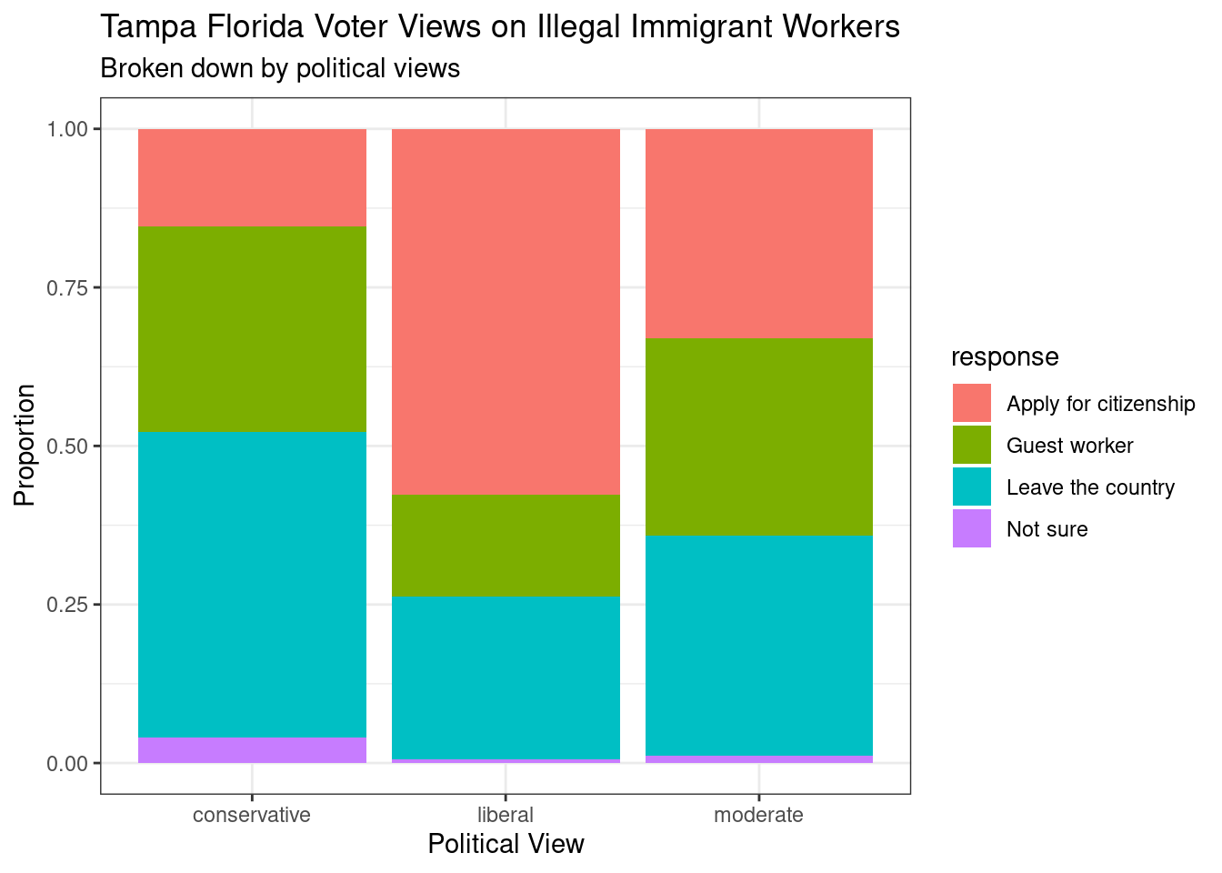
- Using your plot, do political ideology and views on immigration appear to be independent? Explain your reasoning.
The percentages of Tampa, FL voters who are in favor of illegal immigrants working in the US being allowed to stay and apply for citizenship are quite different depending on the voter’s political view. Therefore, the two variables appear to be dependent.
6.2.2 Problem 2
Views on the DREAM Act. The same survey from Exercise 1 also asked respondents if they support the DREAM Act, a proposed law which would provide a path to citizenship for people brought illegally to the US as children.
The data is in the openintro package in the dream data object.
- Create a mosaic plot of political view versus stance on the DREAM Act.
mosaic(stance ~ ideology, data = dream,
       sub = "Voter views on illegal worker status")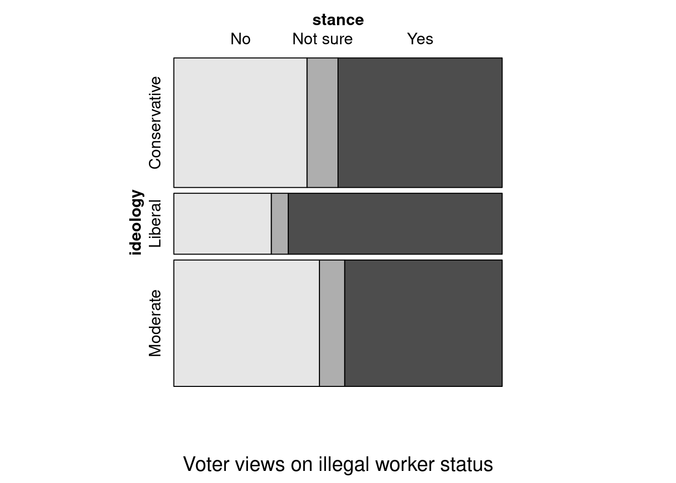
- Based on the mosaic plot, are views on the DREAM Act and political ideology independent?
The vertical locations at which the ideological groups break into the Yes, No, and Not Sure categories differ, which indicates the variables are dependent.
6.2.3 Problem 3
Heart transplants. The Stanford University Heart Transplant Study was conducted to determine whether an experimental heart transplant program increased lifespan. Each patient entering the program was designated an official heart transplant candidate, meaning that he was gravely ill and would most likely benefit from a new heart. Some patients got a transplant and some did not. The variable transplant indicates which group the patients were in; patients in the treatment group got a transplant and those in the control group did not. Another variable called survived was used to indicate whether or not the patient was alive at the end of the study.
The data is in the openintro package and is called heart_transplant.
- Create a mosaic plot of treatment versus survival status.
mosaic(survived ~ transplant, data = heart_transplant)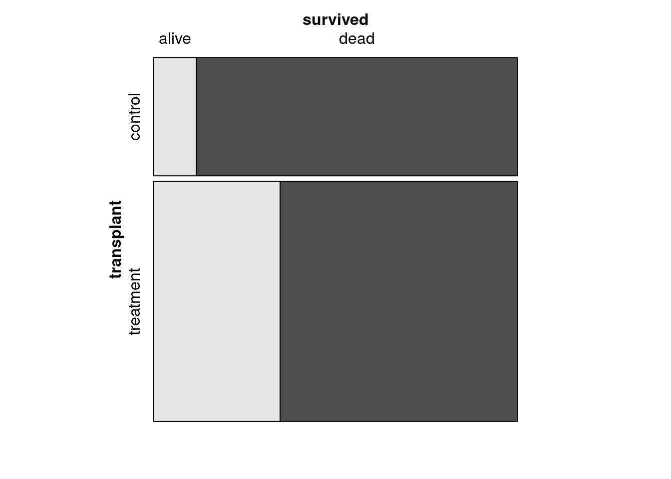
- Based on the mosaic plot, is survival independent of whether or not the patient got a transplant? Explain your reasoning.
The proportion of patients who are alive at the end of the study is higher in the treatment group than in the control group. These data suggest that survival is dependent on whether or not the patient got a transplant.
- Create side-by-side boxplots of survival time for the control and treatment groups.
heart_transplant %>%
  gf_boxplot(survtime ~ transplant) %>%
  gf_labs(title = "Survival times for tranplant experiment",
          sub = "Treatment group had the transplant",
          x = "Tranplant", y = "Survival time in days") %>%
  gf_theme(theme_classic())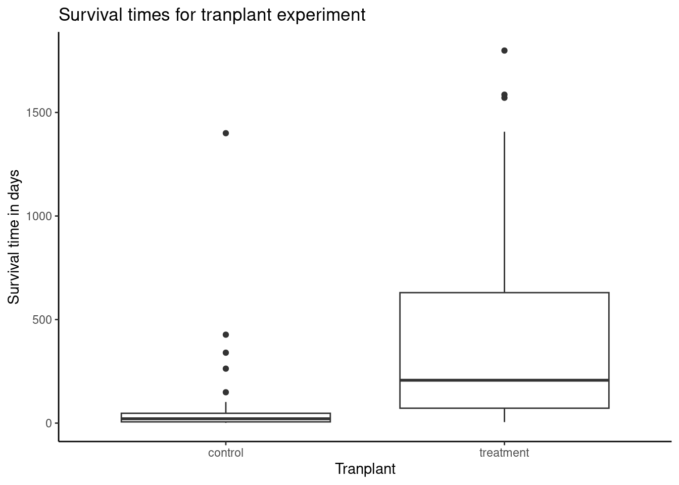
- What do the box plots suggest about the efficacy (effectiveness) of transplants?
The shape of the distribution of survival times in both groups is right skewed, with one very clear outlier for the control group and other possible outliers in both groups on the high end. The median survival time for the control group is much lower than the median survival time for the treatment group; patients who got a transplant typically lived longer. Tying this together with the much lower variability in the control group, evident by a much smaller IQR than the treatment group (about 50 days versus 500 days), we can see that patients who did not get a heart transplant tended to consistently die quite early relative to those who did have a transplant. Overall, very few patients without transplants made it beyond a year while nearly half of the transplant patients survived at least one year. It should also be noted that while the first and third quartiles of the treatment group are higher than those for the control group, the IQR for the treatment group is also much bigger, indicating that there is more variability in survival times in the treatment group.